2027 2028 Trend Forecasts: the Key Color Directions for the Autumn Winter Season
Key Color Directions for Autumn Winter 2027 2028: Balancing Opposites
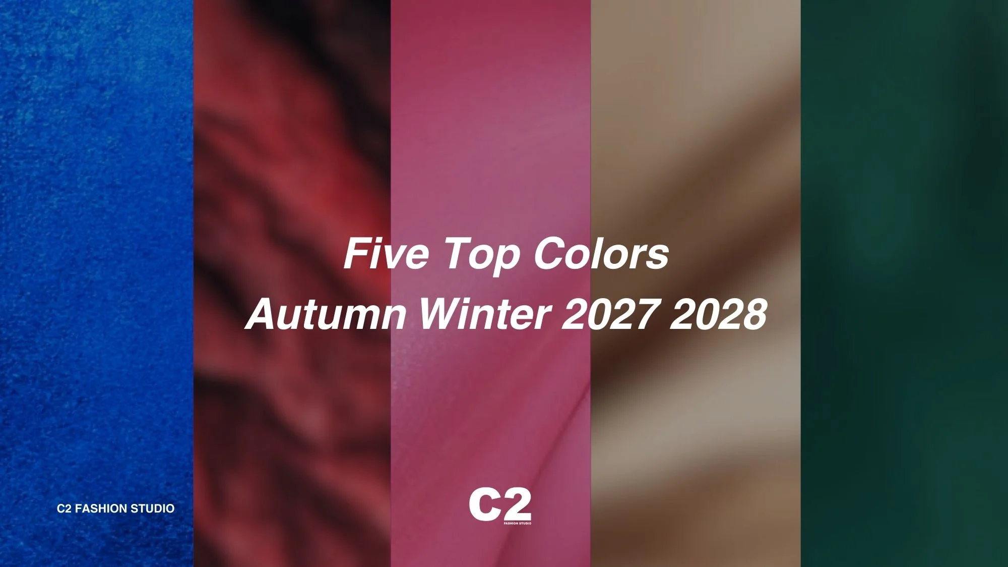
The Trend Colors for Autumn Winter 2027 2028 reflect a season defined by balance, resilience, and duality. In a cultural landscape shaped by both technological acceleration and a renewed need for grounding, color becomes a strategic tool to navigate contrasts. Through Trend Forecasting, five shades emerge as the pillars of the season: True Blue, Rio Red, Pink Cosmos, Brown Rice, and Forest Biome.
These tones act as mediators between heritage and innovation, functionality and emotion, nature and technology.
This Key Color Direction for Autumn Winter 2027 2028 signals that the future of color is not about extremes but about building bridges: a sophisticated palette of cultural anchors that move fluidly across categories, from eveningwear to activewear, interiors to digital fashion.
Fashion Trends and Trend Forecasting Solutions: Emotional Intelligence in Color
The season’s Color Forecasts show how shades are no longer simply aesthetic but emotional signifiers. Consumers are demanding colors that provide reassurance, inspire imagination, and reinforce identity. Trend Forecasting Solutions confirm this shift: color must embody emotional intelligence, offering grounding tones such as Brown Rice and Forest Biome, alongside energizing and visionary hues like Pink Cosmos and True Blue.
For brands and designers, the message is clear: Fashion Trends in 2027/28 will be shaped by colors that express cultural adaptability. This palette works across categories, supporting both heritage-driven luxury and AI-enhanced innovation. By integrating these Trend Colors for Autumn Winter 2027 2028, brands can align with a consumer mindset that values authenticity, resilience, and visionary experimentation.
The result is a chromatic narrative that defines the Color Forecasts for Autumn Winter 2027 2028: not static, but dynamic, versatile, and deeply human, a directional toolkit for the future of fashion and design.
The Five Top Color Trend Forecasts for Autumn Winter 2027 2028
C2 Fashion Studio unveils an elevated and distinctive color direction for Autumn Winter 2027 2028, crafted to capture the cultural transformations and emotional undercurrents defining this pivotal season. This carefully researched palette, envisioned by Cristina Capucci, founder and creative director of C2, together with the studio’s trend forecasting team, reflects a forward-thinking interpretation of global shifts and evolving consumer aspirations.
Each of the five key shades represents more than just a chromatic choice, they embody the dualities shaping design today: innovation and heritage, rationality and emotion, grounding and escapism. Through our exclusive Trend Forecasting Solutions, these colors form a powerful narrative, guiding brands, designers, and creative industries toward relevance and resonance.
The Five Top Color Trend Forecasts for Autumn Winter 2027 2028
- True Blue – Mysterious and eccentric, bridging classically elegant traditions with AI-driven futures.
- Rio Red – Intense and passionate, embodying empowerment and sensual resilience.
- Pink Cosmos – Playful yet futuristic, blending irony, joy, and cosmic imagination.
- Brown Rice – Natural and grounding, symbolizing continuity, care, and material honesty.
- Forest Biome – Restorative and resilient, evoking ecological wisdom and balance.
Together, these colors outline the Key Color Direction for Autumn Winter 20272028, offering a chromatic framework that is versatile, cross-disciplinary, and deeply human. They are designed not only to inspire the world of fashion, but also to resonate across lifestyle, interiors, beauty, and digital realms, affirming C2’s commitment to delivering visionary trend forecasting for the future of design.
True Blue (Pantone 19-4057 TCX): The Mysterious Elegance of Futuristic Heritage
True Blue emerges as one of the defining chromatic statements of Autumn Winter 2027 2028, a shade that balances mystery and eccentricity while retaining timeless appeal. At once grounded and visionary, this powerful hue resonates across categories, from the precision of formalwear to the dynamism of activewear, embodying a new dimension of versatility.
In a season framed by the interconnection of polarities, True Blue color trend acts as a bridge between contrasts: functionality and spirituality, innovation and tradition, pragmatism and emotion. This duality mirrors the cultural climate of 2027 2028, where the influence of artificial intelligence intersects with the human desire for authenticity and ritual. The result is a color that feels simultaneously futuristic and familiar, a contemporary code of elegance rooted in heritage yet open to technological experimentation.
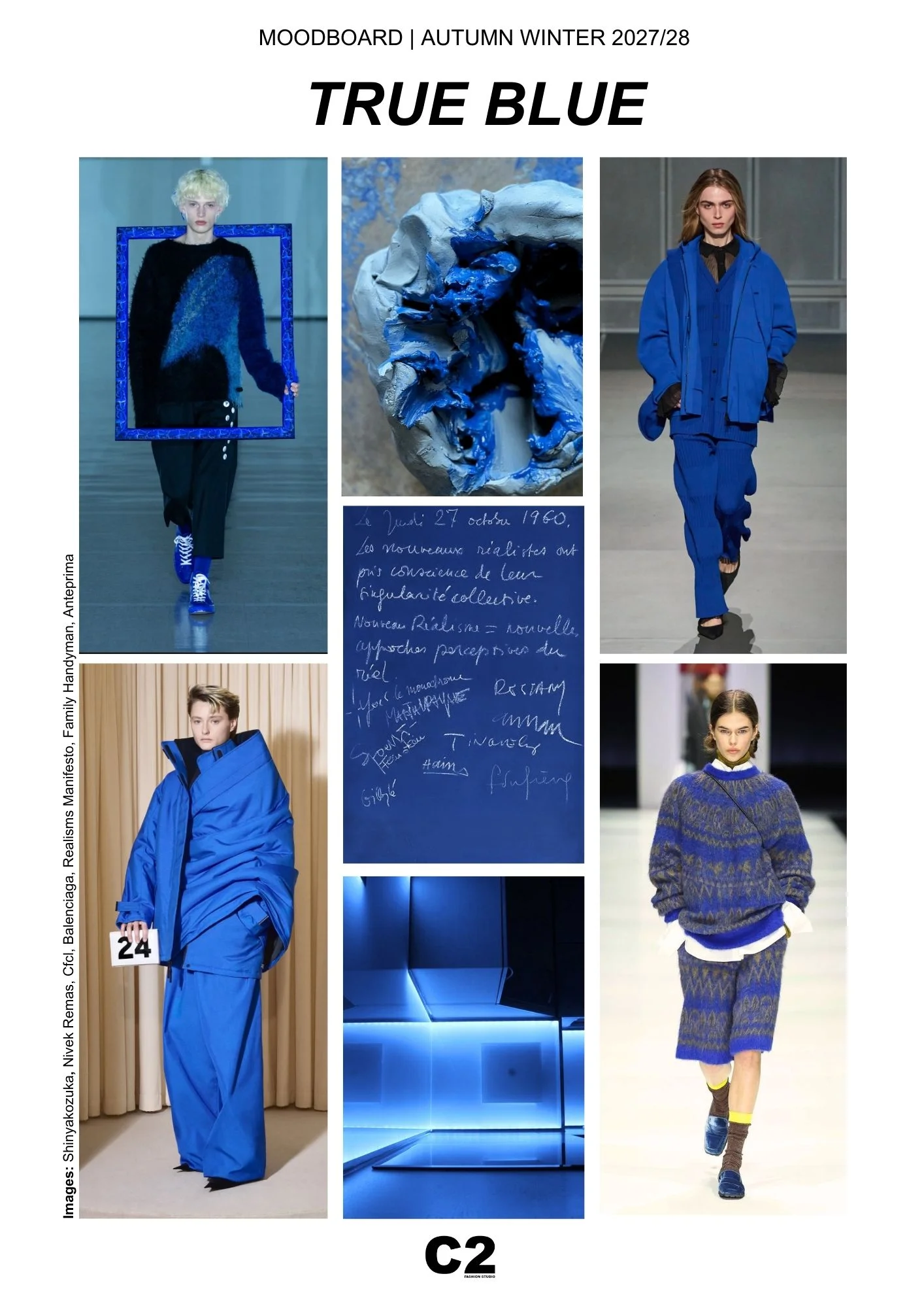
True Blue evokes the idea of being traditional in class, with echoes of uniforms (as for example future space uniforms), tailoring, and ceremonial attire, but is equally capable of adapting to the bold narratives of digital culture. Its depth recalls Yves Klein’s artistic radicalism, yet its vibrancy speaks to an era where immersive experiences, from metaverse platforms to AI-generated aesthetics, are increasingly intertwined with real-world creativity.
Socio-cultural references reinforce this chromatic choice: in times of political fragmentation and ecological anxiety, blue continues to symbolize stability and trust, but here it is reimagined as an eccentric protagonist rather than a passive backdrop. It connects to the cultural rise of “digital spirituality,” where meditative practices are enhanced by AI tools, and where design seeks to merge sensory calm with technical innovation.
Within fashion, True Blue offers immense potential. In knitwear, it channels tactile comfort and emotional resonance; in outerwear, it sharpens architectural silhouettes with striking visibility; in eveningwear, it transforms into a statement of quiet opulence. Designers experiment with texture to enhance the hue’s depth, from matte wool blends to iridescent synthetics, reinforcing its cross-sector relevance.
The appeal of True Blue extends beyond aesthetics. It becomes a symbolic anchor for consumers navigating constant flux, offering reassurance while sparking imagination. Positioned at the intersection of past and future, this hue encapsulates the spirit of Autumn Winter 2027 2028: a season defined by balance between rational design and emotive expression, between tradition and AI-driven innovation.
True Blue is a manifesto of contemporary duality.
Rio Red (Pantone 19-1656 TCX): The Passionate Strength of Ceremonial Power
As Color Trend for Autumn Winter 2027/28, Rio Red dominates as a statement of unapologetic intensity. A hue that is simultaneously sensual and authoritative, it channels a visceral energy capable of redefining both the codes of elegance and the language of modern performance. According to Trend Forecasting, Rio Red functions as an emotional catalyst, conveying passion, power, and resilience in an era that seeks boldness amidst uncertainty.
This shade thrives in the cultural tension of the season, where extremes of rationality and instinct, restraint and excess, are continuously negotiated. Its presence evokes both ceremonial grandeur and playful liberation, making it as relevant for evening couture as it is for directional streetwear. Rooted in the warmth of tradition yet charged with contemporary daring, Rio Red Color Trend mirrors the dual forces shaping society: the human desire for sensuality and intimacy, and the digital drive for visibility and spectacle.
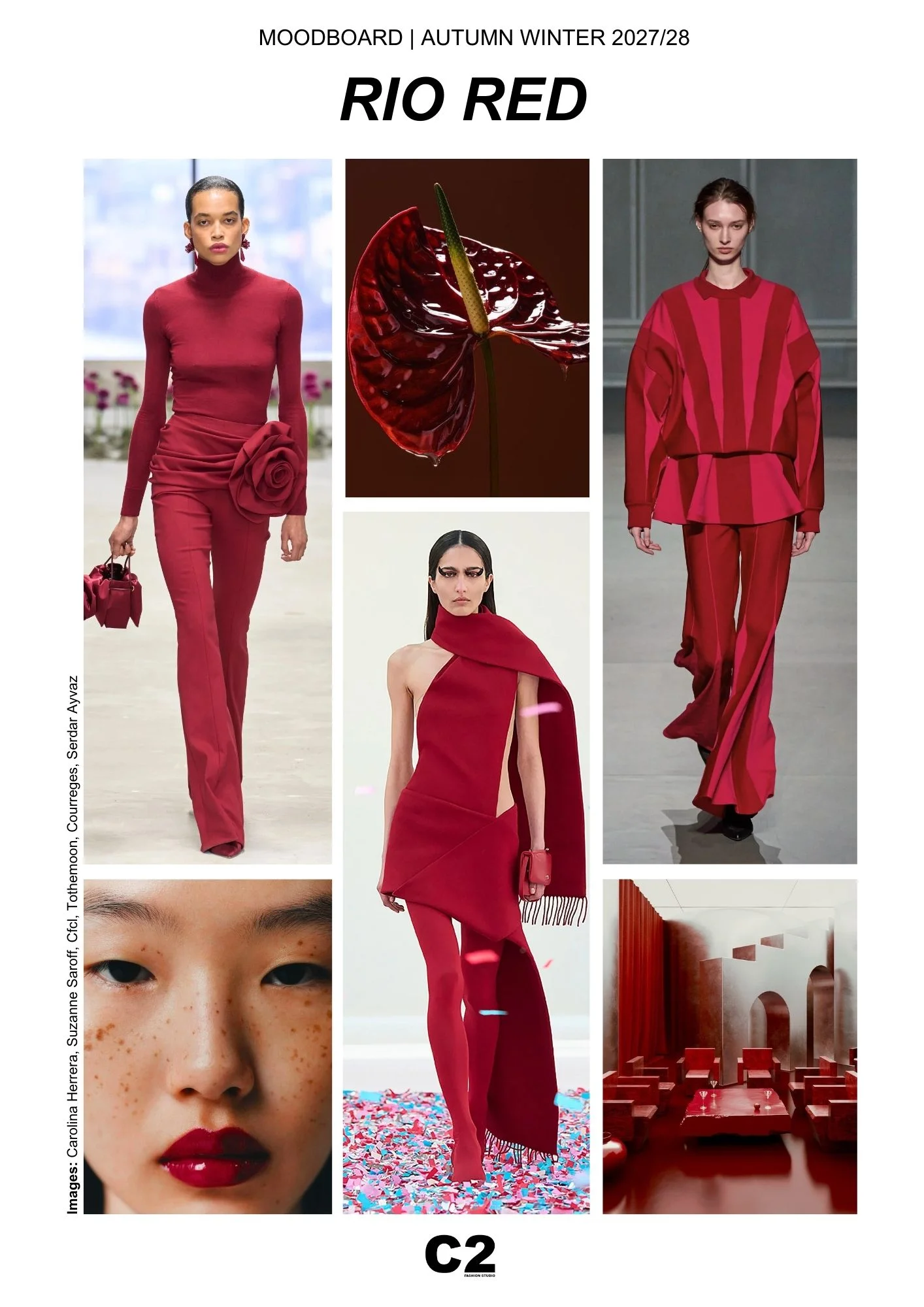
Socio-cultural signals highlight the growing role of emotional expressiveness in an AI-enhanced landscape. As algorithms filter and optimize aesthetics, consumers crave raw intensity, colors that embody a human touch impossible to replicate. Rio Red answers this call by offering a visual and emotional anchor, an affirmation of individuality and sensual confidence. It resonates with cultural movements celebrating vulnerability and empowerment, echoing feminist discourses, queer aesthetics, and global rituals that use red as a marker of identity and collective strength.
In fashion, Rio Red demonstrates remarkable adaptability. In tailoring, it underscores sculptural forms with bold clarity. In knitwear and casualwear, it adds vibrancy and energy to everyday pieces. In eveningwear, it radiates a dramatic allure, flirting with notions of seduction and rebellion. Its depth also lends itself to experimental applications, from high-shine lacquered finishes to matte technical fabrics, reinforcing its cross-genre appeal from luxury to activewear.
Beyond fashion, Rio Red infiltrates the cultural imagination as a spatial and lifestyle code. From immersive interiors drenched in saturated hues to beauty rituals where red lips and nails become statements of identity, this tone suggests both intimacy and performance. It positions itself as a driver of multisensory experience, stimulating sight, touch, and emotion in equal measure.
For Autumn Winter 2027 2028, Rio Red is not simply a trend color but a cultural force: celebratory, defiant, and profoundly human. It captures the season’s essence, the balance of ritual and innovation, of collective energy and individual assertion, standing as a vivid emblem of passion in an increasingly hybrid world.
Pink Cosmos (Pantone 16-2122 TCX): The Playful Imagination of Cosmic Escapism
Pink Cosmos color trend rises as a radiant emblem of Autumn Winter 2027 2028, embodying the duality of softness and bold eccentricity. A hue that bridges hyper-femininity with futuristic imagination, it speaks to both nostalgic familiarity and cosmic exploration. Positioned at the intersection of digital culture and emotional intimacy, Pink Cosmos is more than a playful shade, it is a narrative of identity, freedom, and reinvention.
The name itself evokes vast horizons, merging the earthly with the infinite. From Barbiecore aesthetics that redefined cultural conversations in the early 2020s to the expanding visions of space travel and interplanetary futures, Pink Cosmos symbolizes how color becomes a medium for escapism and empowerment. Its resonance with Gen Z and Gen Alpha audiences lies in its ability to be both ironic and aspirational, allowing it to function as a cultural signifier that transcends generations.
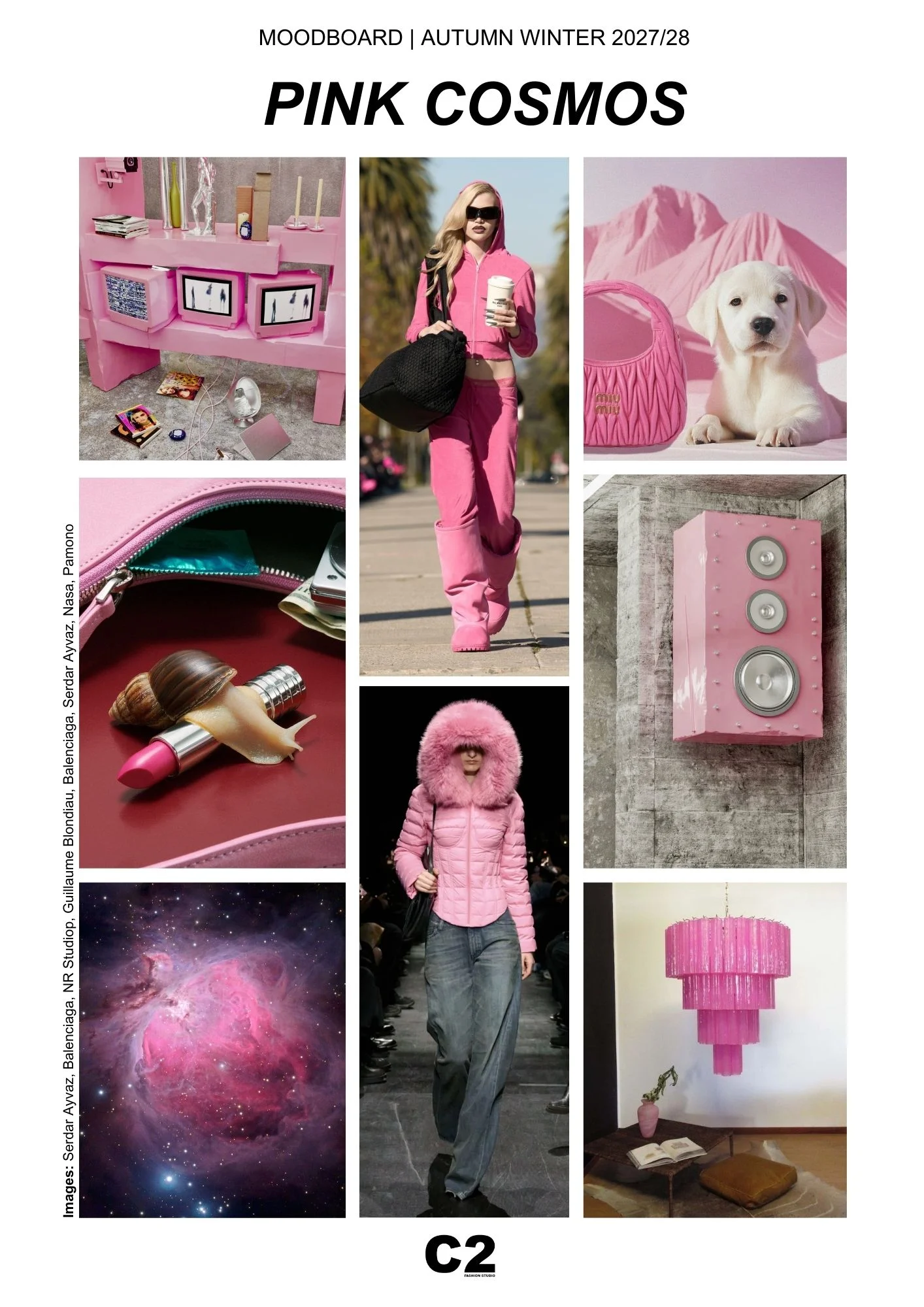
Socio-culturally, Pink Cosmos reflects the desire to reclaim softness as strength. In a period when artificial intelligence drives rational systems and hyper-optimized aesthetics, this shade celebrates imperfection, sensuality, and play. It echoes the emotional currency of online culture, where pink filters, avatars, and immersive aesthetics shape digital identities. At the same time, it connects to wellness rituals, self-care, and community-driven movements that seek refuge in joy and tenderness against a backdrop of ecological and political complexity.
Within fashion, Pink Cosmos expands its versatility. In outerwear, it becomes statement-making, amplifying volume and presence; in knitwear, it channels comfort with a touch of irony; in accessories, it transforms into an object of desire, ranging from glossy bags to playful footwear. Its spectrum spans from matte powder finishes to high-shine lacquered textures, enabling experimentation across luxury, casual, and activewear segments.
Beyond apparel, Pink Cosmos finds expression in lifestyle, design, and beauty. Interiors adopt it as a daring accent, while beauty products emphasize individuality with glossy lips and radiant cheeks. Technology and entertainment also embrace the hue, from gaming avatars to neon-lit digital spaces, underlining its role in shaping multisensory and hybrid experiences.
For Autumn Winter 2027/28, Pink Cosmos positions itself as a symbol of joyful rebellion. It captures the spirit of emotional liberation while resonating with futuristic narratives, standing as both an aesthetic indulgence and a cultural statement. In its orbit lies a promise: the power to dream, play, and connect, in the real world and far beyond.
Brown Rice (Pantone 13-1105 TCX): The Grounded Minimalism of Timeless Continuity
Brown Rice color trend emerges in Autumn Winter 2027/28 as a new neutral with quiet strength and tactile warmth. Neither austere nor overly decorative, this grounded shade channels the essence of natural minimalism while aligning with cultural desires for authenticity, comfort, and permanence. Subtle yet commanding, according to trend Forecasting, Brown Rice is an ode to material honesty, a color that feels both ancient and forward-looking, balancing the human instinct for grounding with the technological futures unfolding around us.
Its appeal lies in its ability to embody contradictions: refined yet raw, familiar yet innovative. As society oscillates between hyper-digitization and a renewed longing for connection with the tangible world, Brown Rice becomes a chromatic anchor. It recalls the intimacy of unrefined grains, earthen textures, and artisanal craft, while also resonating with architectural minimalism and contemporary design. In this way, it captures the 2027/28 theme of interconnection between polarities, serving as a visual metaphor for functionality balanced with emotion, pragmatism infused with poetry.
Socio-cultural references reinforce its significance. Amid ecological urgency and rising climate consciousness, consumers increasingly seek materials and colors that evoke circularity, repair, and continuity. Brown Rice reflects this cultural shift: it symbolizes nourishment, ritual, and community while connecting to the aesthetics of sustainable luxury. Its resonance with well-being and slowness mirrors broader movements in wellness culture, where grounding hues support mental balance in overstimulated environments.
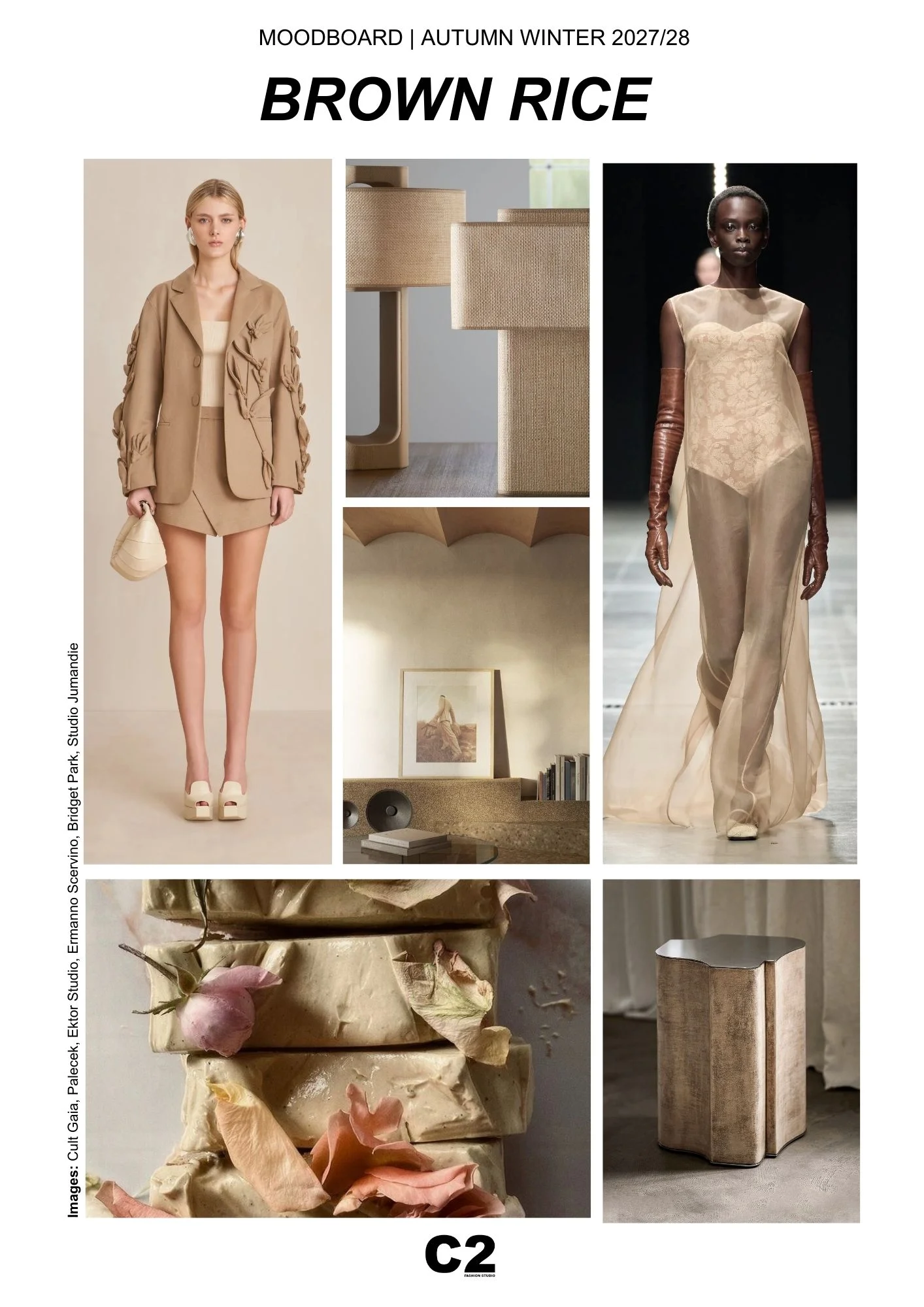
In fashion, Brown Rice demonstrates versatility across categories. In tailoring, it introduces a sophisticated neutrality, pairing seamlessly with both vibrant and muted palettes. In sheer and fluid fabrics, it evokes sensual delicacy, while in structured outerwear, it communicates resilience and timelessness. Accessories in this tone embody modern functionality, from sculptural bags to minimalist footwear, reinforcing the idea of enduring design over seasonal novelty.
Beyond apparel, Brown Rice permeates lifestyle and interiors. It connects to the rise of bio-based materials and regenerative craft, appearing in home objects that emphasize tactility and artisanal finishes. In beauty, it suggests a quiet sophistication, understated tones for skin, lips, and nails that echo natural radiance. Its adaptability across disciplines underscores its role as a universal neutral for a season defined by balance and recalibration.
For Autumn Winter 2027/28, Brown Rice is a cultural statement. Anchoring innovation in tradition, it represents a collective desire for calm resilience, reconnecting design with the rhythms of nature while shaping a future of enduring elegance.
Forest Biome (Pantone 19-5230 TCX): The Restorative Balance of Ecological Wisdom
Forest Biome emerges in Autumn Winter 2027/28 as a deeply restorative green, echoing the richness of woodland ecosystems and the emotional pull of natural environments. This shade is immersive, grounding, and sophisticated, a color trend that captures the equilibrium between resilience and serenity, tradition and innovation. With its depth and intensity, Forest Biome extends beyond fashion into lifestyle and design, becoming a chromatic expression of sustainability, wellness, and the search for balance in turbulent times.
At its core, Forest Biome is about interconnection. It reflects the cultural dialogue of the season, where polarities such as technology and nature, rationality and emotion, are continuously reconciled. As artificial intelligence redefines aesthetics and functionality, this tone reminds us of the importance of grounding design in ecological awareness and human sensibility. Much like the forest itself, a biome that sustains, protects, and regenerates, this green becomes a visual metaphor for resilience, adaptability, and hope.
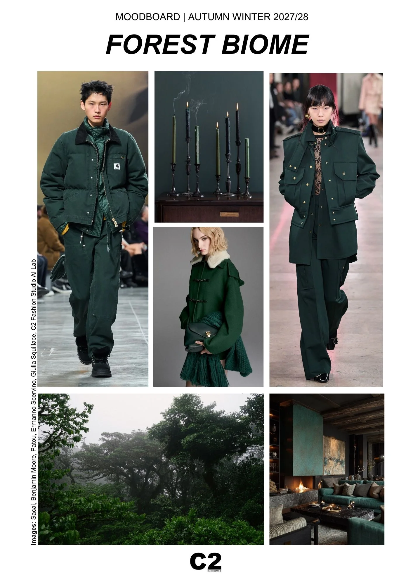
Socio-cultural shifts reinforce its relevance. The rising influence of regenerative culture and biomaterial innovation has placed the natural world at the center of creative thinking. Forest Biome aligns with these movements, embodying the aesthetics of eco-luxury and the urgency of climate-conscious design. It resonates with the growing appeal of “rewilding” , both in ecological terms and as a lifestyle philosophy that encourages slowing down, reconnecting with nature, and finding spiritual grounding amid digital saturation.
In fashion, Forest Biome has extraordinary adaptability. In outerwear and tailoring, it conveys authority and endurance, often paired with functional silhouettes and technical details. In softer applications, such as knitwear or draped fabrics, it takes on a calming, meditative quality. Accessories in this shade carry a subtle yet powerful elegance, whether in leather goods or refined details. Its versatility lies in its ability to move seamlessly from utilitarian workwear to elevated eveningwear, making it a foundational hue for both heritage and contemporary wardrobes.
Beyond fashion, Forest Biome extends into interiors, wellness spaces, and immersive environments. It creates atmospheres of calm sophistication, often paired with natural materials such as wood, stone, and bronze. In beauty, it inspires earthy palettes and grounding rituals, reflecting a return to elemental aesthetics.
For Autumn Winter 2027 2028, Forest Biome is a cultural anchor. It embodies a collective desire for connection, offering a pathway toward balance by merging ecological intelligence with aesthetic refinement.
The C2 Trend Platform: Exclusive Color Trend Insights for Autumn Winter 2027 2028
Save the Date: 22 September 2025
In addition to the five headline shades: True Blue, Rio Red, Pink Cosmos, Brown Rice, and Forest Biome, the Autumn Winter 2027 2028 Color Forecast introduces five additional exclusive hues, revealed only on the C2 Trend Platform and accessible to subscribers from 22 September 2025.
With early insights, comprehensive trend analysis, and exclusive color forecasts, the C2 Trend Platform equips fashion professionals with the tools to anticipate market shifts and align collections with evolving consumer mindsets.
Understanding the Trend Colors for Autumn Winter 2027 2028 means going beyond surface aesthetics. Each hue reflects cultural narratives and emotional undercurrents, decoded through the platform’s in-depth socio-cultural analysis. By mapping consumer behavior, global influences, and cultural dynamics, the C2 Trend Platform empowers brands, designers, creative directors, and industry insiders to shape collections that are not only trend-forward but also profoundly relevant.
Join C2 Trend Platform: Unlock the Full Autumn Winter 2027 2028 Color Forecasts and Insights
The five key shades presented here are only the starting point of the season’s story. To access the complete palette and gain expert analysis on each hue’s impact across fashion, lifestyle, and culture, professionals are invited to join the C2 Trend Platform.
Subscribers gain exclusive access to early forecasts, cutting-edge trend forecasting solutions, and curated seasonal insights designed to inspire, inform, and drive creative strategy. By leveraging the intelligence of C2, fashion professionals can stay ahead of competitors and create collections that resonate with the season’s Key Color Direction for Autumn Winter 2027 2028 and the emotional expectations of tomorrow’s consumers.


Trend Forecasting Intelligence
C2 Trend Platform.
Structured trend forecasting for clarity, product direction, and collections aligned with future demand.
Trend Forecasting Intelligence