Spring Summer 2028 Preview: The Luminous Balance Powering Next-Gen Color Trend Forecast
A C2 exclusive vision for Spring Summer 2028 color direction
Spring Summer 2028 Color Trend Forecast: The Luminous Balance Elevating the New Season’s Identity
Spring Summer 2028 introduces a new chromatic language shaped by the complexity of contemporary life and the rising need for design that feels intelligent, expressive, and emotionally attuned. The SS28 Color Trends do more than outline palettes — they mark a perceptual shift, redefining how light interacts with materials, surfaces, and future-facing silhouettes.
In an era shaped by mobility, fluid schedules, hybrid environments, and a growing desire for balance, color becomes a tool of functional emotion: something that supports, regulates, and elevates the body and the mind.
At C2, we define this chromatic movement with a signature concept: Luminous Balance.
It represents the idea that clarity, softness, and energy can coexist within a palette that speaks of the future without feeling alien, and of everyday life without falling into neutrality.
The Rise of Luminous Neutrals: When Softness Becomes a Signal
The first direction of the Spring Summer 2028 Color Trends is a new generation of luminous neutrals. Not “quiet,” not “minimal,” but engineered with a perceptual intelligence that feels scientific and sensorial at the same time.

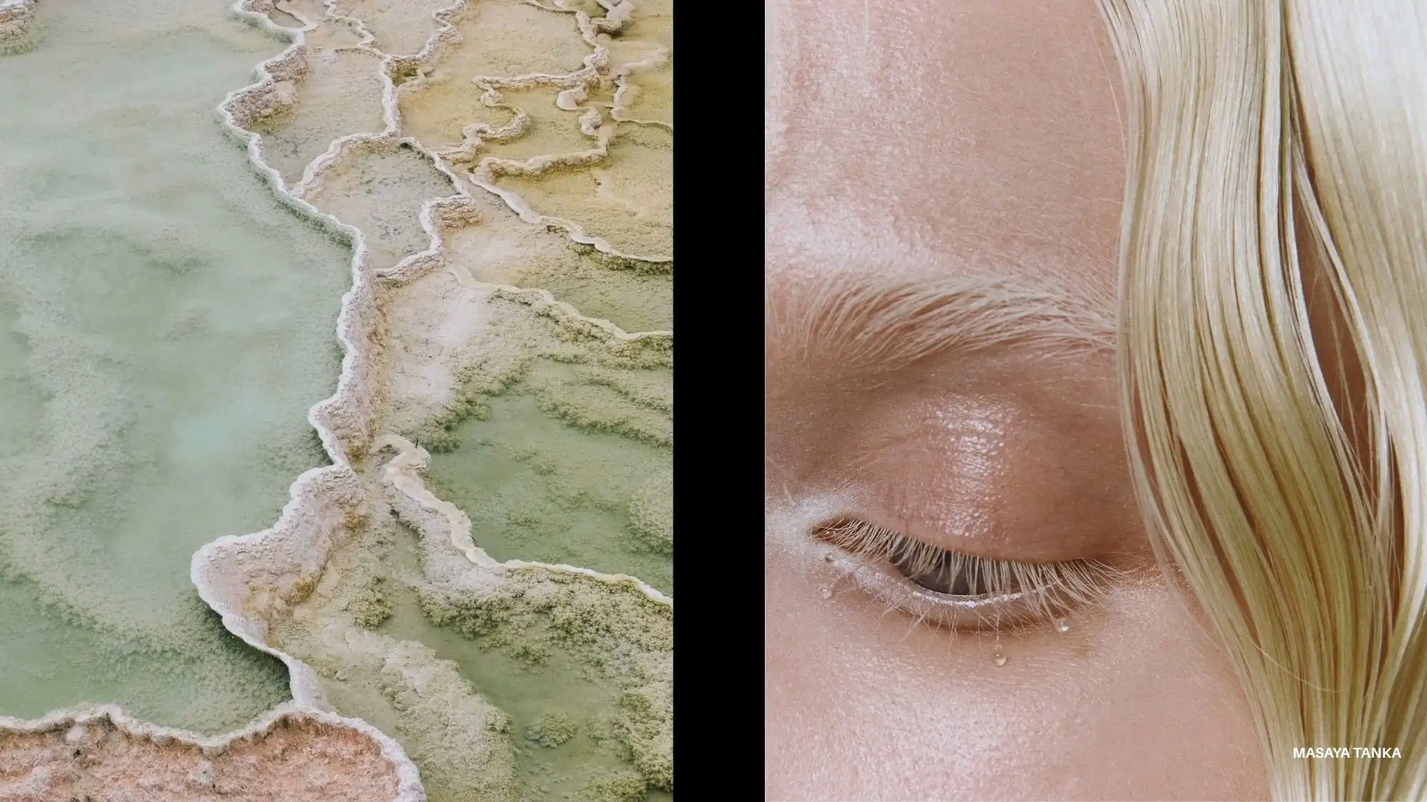
The first chapter of the Spring Summer 2028 Color Trends reveals a generation of luminous neutrals crafted to reduce visual friction. In the C2 reading, these neutrals carry a quiet intensity — they are soft, but never passive.
These shades — mineral light, softened sand, diffused warmth and subtle blush undertones — create a diffused radiance, soft yet intentional, generating surfaces that seem to shift gently with movement.
From a trend forecasting perspective, C2 Fashion Studio interprets these neutrals as emotional stabilizers. They create continuity across categories — activewear, resortwear, tailoring, lifestyle goods — offering designers a resilient base capable of shaping modernity without overstatement.
The Spring Summer 2028 Color Forecasts preview highlights how these neutrals operate as both a structural base for technical-fluid textiles and as a sophisticated backdrop for evolved tailoring.
This palette expresses emotional minimalism — tactile, calming, almost therapeutic — offering coherence and presence without heaviness. It’s a strategic color family for brands working at the intersection of comfort, movement, and contemporary refinement.
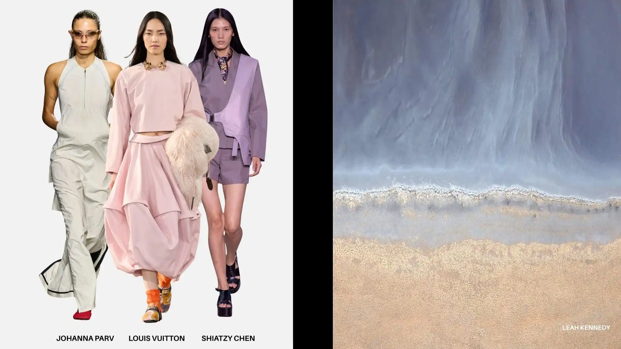
Chromatic Breeze: Pastels Reinvented with Aerodynamic Light
Pastels return, but with no trace of nostalgia.
C2 identifies the return of pastels in Spring Summer 2028 as a cultural shift toward emotional lightness, not nostalgia. These pastels are not sweet — they are aerodynamic.
Filtered aqua notes, softened pear-yellow light, powdered rose undertones, and diffused mineral beige define this dimension of the Spring Summer 2028 Color Trend Forecast. These tones feel breathable and atmospheric, ideally suited to ultra-light constructions, technical sheers, layered performance fabrics, and finely textured surfaces that respond subtly to motion.
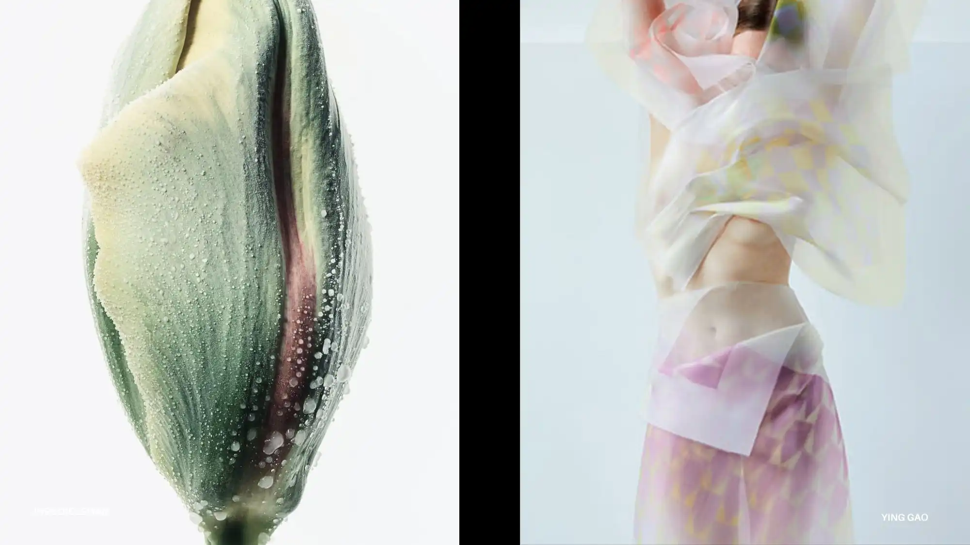
These pastels are not sweet — they’re high-tech. They represent a refined version of youth culture and a more evolved feminine language, with strong potential for premium activewear, luxury resortwear, and accessories with tactile appeal.
Their power lies in transition: they behave like atmospheres, not flat pigments.
For SS28, this category will be key for brands seeking visual softness, emotional modernity, and a subtly futuristic appeal.
Solar Chromatics: Brights with Orbital Energy as Spring Summer 2028 Color Trends
The Spring Summer 2028 Color Trends preview also introduces brighter inflections charged with calibrated intensity: radiant mineral orange, deep rhythmic red, luminous ionic-yellow, and fluid aqua-blue.
In C2’s interpretation, these tones carry the energy of acceleration — not chaotic, but intentional. They represent a desire for vitality, optimism, and a refined futuristic edge.
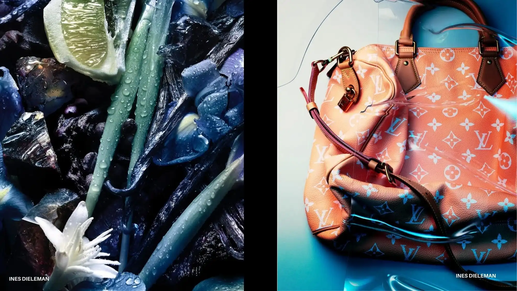
radiant mineral orange, deep rhythmic red, luminous ionic-yellow, and fluid aqua-blue emerge as the protagonists of this vivid direction, drawing inspiration from light physics, digital culture, and celestial movements.
These tones shine when applied to smart surfaces, iridescent coatings, performance textiles, and hybrid aesthetics. They work for sleek sports capsules as well as for fashion-forward accessories and footwear seeking a “touch of future.”
In advanced trend forecasting, these bright tones represent a strategic shift: energetic yet sophisticated, futuristic but grounded in real-life versatility.
For designers and brands, these brights offer an opportunity to create iconic brand signatures: that one color that defines a collection or reconnects a label to its emotional core.
Cooling Deep Chromes: The New Dark for Hot Seasons
One of the most sophisticated signals in the Spring Summer 2028 trend forecasts is the arrival of cooling deep chromes. These are not traditional darks; they are sculpted shadows.
Photonic deep blue, cool graphite, high-frequency hues, and tech-shadow violet form a new category of “smart darks.”
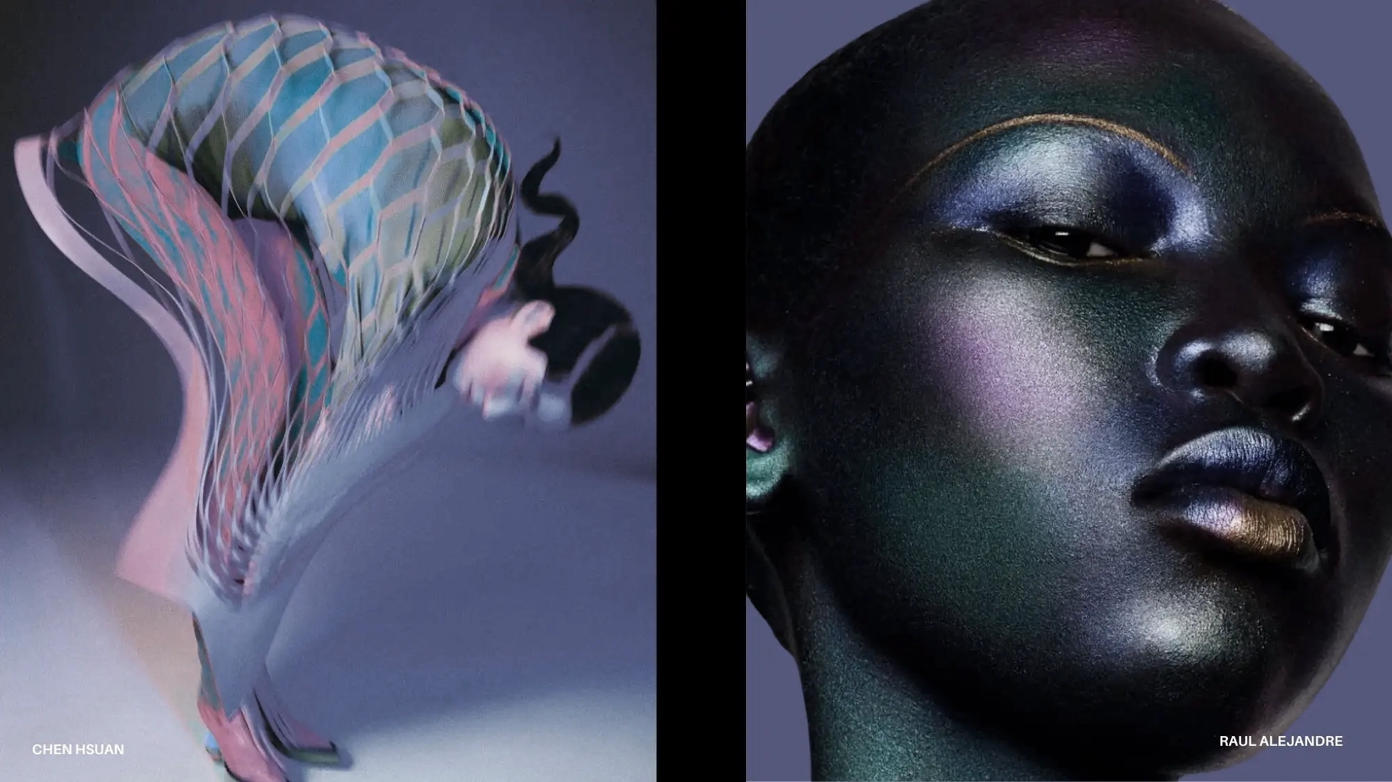
In C2’s analysis, these tones represent structured depth — a counterbalance to fluid silhouettes and translucent surfaces.
They are ideal for matte-gloss contrasts, satin-coated surfaces, soft-touch metallics, and reconstructed textiles.
They add dimension and depth without the visual weight associated with traditional dark palettes.
In future-oriented Spring Summer 2028 trend forecasts, these deep chromes emerge as the seductive counterpoint to lightness — the element that grounds fluid silhouettes, adds density, and shapes a sophisticated aesthetic that feels modern rather than dramatic.
Luminous Balance as the Color Culture’s Signature for SS28
Spring Summer 2028 is a shift in how we understand color as a cultural, emotional, and functional engine.
Luminous neutrals, aerodynamic pastels, solar brights, and cooling deep chromes together form a chromatic system that synthesizes clarity, softness, energy, and emotional intelligence.
For designers, brands, and creative directors, these SS28 Color Trends offer a narrative opportunity: colors that guide rather than shout, illuminate rather than decorate, and articulate the rhythm of a cultural landscape in transition.


Trend Forecasting Intelligence
C2 Trend Platform.
Structured trend forecasting for clarity, product direction, and collections aligned with future demand.
Trend Forecasting Intelligence