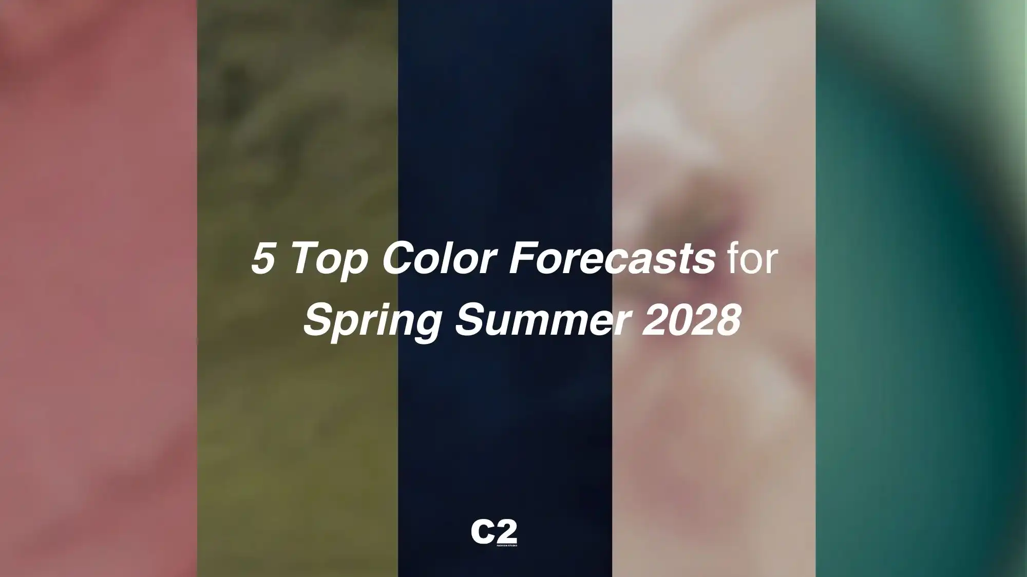
2028 Trend Forecasts: The Key Color Directions for the Spring Summer Season by C2 Fashion Studio
Spring Summer 2028: Color Forecasts Driven by Stability, Luminous Balance, Clarity and Renewed Energy
Spring Summer 2028 represents a clear turning point in the cultural role of color. According to C2 Fashion Studio, this season moves beyond expressive excess to embrace stability, luminous balance, and perceptual clarity as guiding principles across fashion, lifestyle, and product design. In a world defined by continuous complexity, color evolves into a tool for orientation—designed to calm, structure, and sustain rather than compete for attention.
Within the discipline of long-range trend forecasting, the Color Trend Forecasts for Spring Summer 2028 reveal a palette shaped by softness and light control. Rather than relying on high contrast or visual shock, SS28 color trends focus on measured luminosity, where light is diffused, surfaces are breathable, and tones interact gently with one another. The result is a chromatic system that supports emotional balance and long-term relevance.
The five key color directions—Ash Rose, Green Olive, Moonlit Ocean, Linen, and Aquacade—work together as a coherent structure. Each contributes to a seasonal language defined by quiet strength, refined clarity and renewed energy, rather than spectacle.
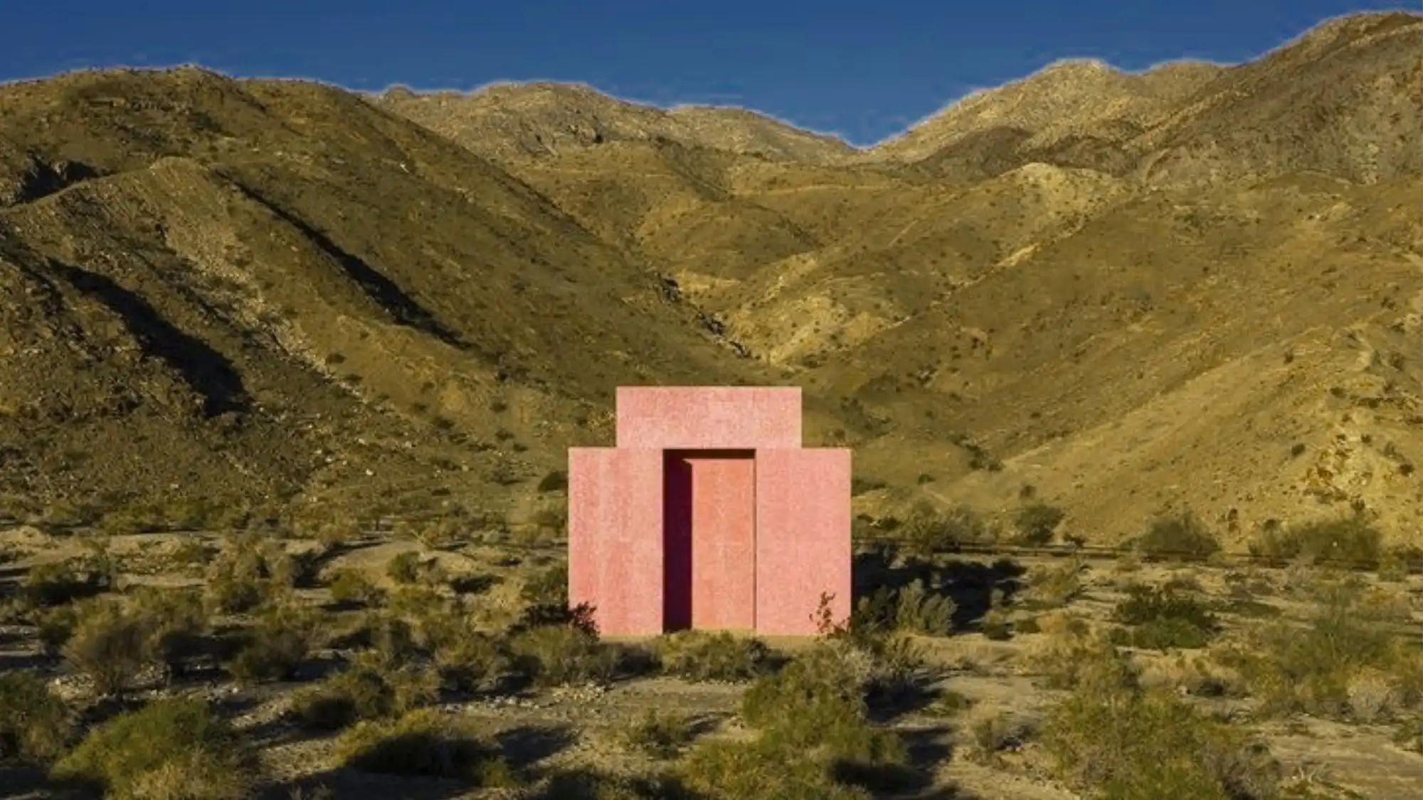
Ash Rose introduces a human, epidermal softness that responds to the growing need for emotional grounding. Muted and mature, this tone supports stability by offering warmth without sentimentality. It reflects a desire for comfort that feels intentional and composed, positioning gentleness as a form of strength within SS28 color trends.
Green Olive anchors the palette in a sense of controlled natural balance. Neither decorative nor nostalgic, this color reflects a pragmatic relationship with the environment—one defined by durability, functionality, and equilibrium. It contributes to the season’s stabilising language by reinforcing material honesty and adaptive design thinking.
Moonlit Ocean serves as the structural backbone of the Spring Summer 2028 color trends. This deep, restrained navy replaces traditional black with a softer yet equally authoritative presence. It conveys reliability, order, and permanence, making it essential for collections that aim to communicate confidence and longevity.
Linen acts as a stabilising neutral throughout the SS28 palette. Warm, tactile, and breathable, it creates visual continuity and reduces contrast fatigue. Linen supports layering and cross-category applications, reinforcing a sense of calm and coherence across fashion, interiors, and brand environments.
Aquacade completes the system with a controlled sense of renewal. This refined aqua tone introduces freshness without volatility, evoking water and air as symbols of balance and regeneration rather than escape.
Together, these Color Trends for Spring Summer 2028 define a season where stability becomes a creative strategy. According to C2 Fashion Studio, SS28 color forecasting is not about chasing immediacy, but about building palettes that endure—supporting clarity, emotional balance, and sustainable design decisions over time.
“Spring Summer 2028 colors perform at a human level — shaping how we feel, perceive, and remain balanced in complexity.” – Cristina Capucci
The 5 Top Color Trend Forecasts for Spring Summer 2028
The Spring Summer 2028 color trends reflect a refined shift toward stability, luminous balance, and clarity. According to C2 Fashion Studio, the Top Color Trend Forecasts for SS28 are designed as anchoring systems rather than decorative accents, supporting long-term relevance across fashion, lifestyle, and product design.
In contemporary trend forecasting, color evolves into a strategic tool that stabilises perception and guides emotional response. The five key colors for Spring Summer 2028 balance depth and softness, diffused light and controlled saturation, responding to a global need for calm, continuity, and renewed energy. These Color Trends for Spring Summer 2028 prioritise adaptability, sensory comfort, and clarity, defining a season built on thoughtful design and enduring visual intelligence.
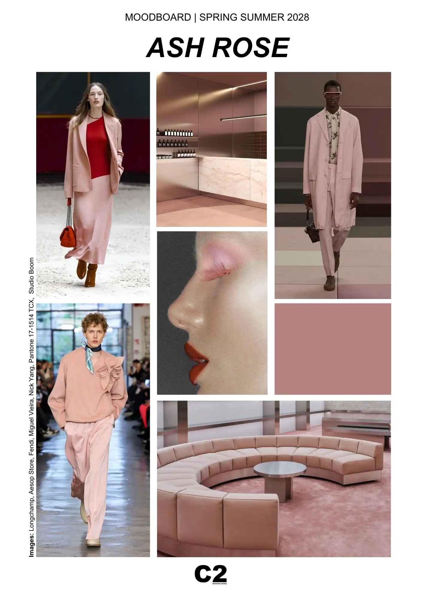
ASH ROSE – Pantone 17-1514 TCX | Spring Summer 2028 Color Trend Forecast
In the Spring Summer 2028 color trend forecasts, Ash Rose (Pantone 17-1514 TCX) emerges as a key anchor that reflects not only cultural sensitivity, but also systemic, economic, and material shifts shaping the season. Interpreted through C2 Fashion Studio’s forecasting methodology, Ash Rose signals a move toward colors that stabilise perception, support longevity, and translate softness into strategic value.
Ash Rose is a desaturated, mineral rose with muted undertones that remove any sense of nostalgia or overt romanticism. Within SS28 color trends, it represents a recalibration of warmth—controlled, mature, and intentional. This evolution responds to a broader demand for reliability and clarity across design systems, where color must perform across multiple contexts rather than exist as a purely expressive statement.
Ash Rose reflects a sociocultural shift toward emotional maturity and quiet reassurance. In Spring Summer 2028, this color resonates with a collective need for intimacy that feels composed rather than exposed. It mirrors a cultural climate where vulnerability is no longer performative, but integrated into everyday life with discretion and self-awareness. Ash Rose echoes skin, touch, and presence, translating care into a visual language that feels grounded and real. It aligns with societies redefining strength through empathy, balance, and emotional regulation, positioning softness as a sign of control rather than fragility.
From a material and product perspective, Ash Rose aligns with the rise of tactile, low-gloss surfaces and refined finishes. It performs exceptionally well on soft tailoring, fluid knits, coated fabrics, leather alternatives, ceramics, and architectural interiors, offering consistency across fashion, accessories, and lifestyle categories. Its neutrality allows it to integrate seamlessly into modular wardrobes and long-life product strategies, supporting continuity rather than seasonal disruption.
In beauty and wellness, Ash Rose resonates with the shift toward skin-adjacent tones, sheer textures, and formulations that prioritise comfort and care. In retail and brand environments, it contributes to calm, immersive spaces designed to reduce visual fatigue and increase dwell time—an increasingly relevant factor in experiential design and consumer engagement.
According to insights developed by C2 Fashion Studio, and reinforced by parallel signals in technology, wellness, and material innovation, Ash Rose reflects a season where softness becomes operational. It communicates trust, emotional safety, and composure—qualities that are increasingly valuable in brand positioning and consumer decision-making.
As part of the Color Trends for Spring Summer 2028, Ash Rose embodies a form of renewed energy that is subtle and enduring. It supports a season defined by stability, luminous balance, and clarity, positioning color as an infrastructure for modern living.
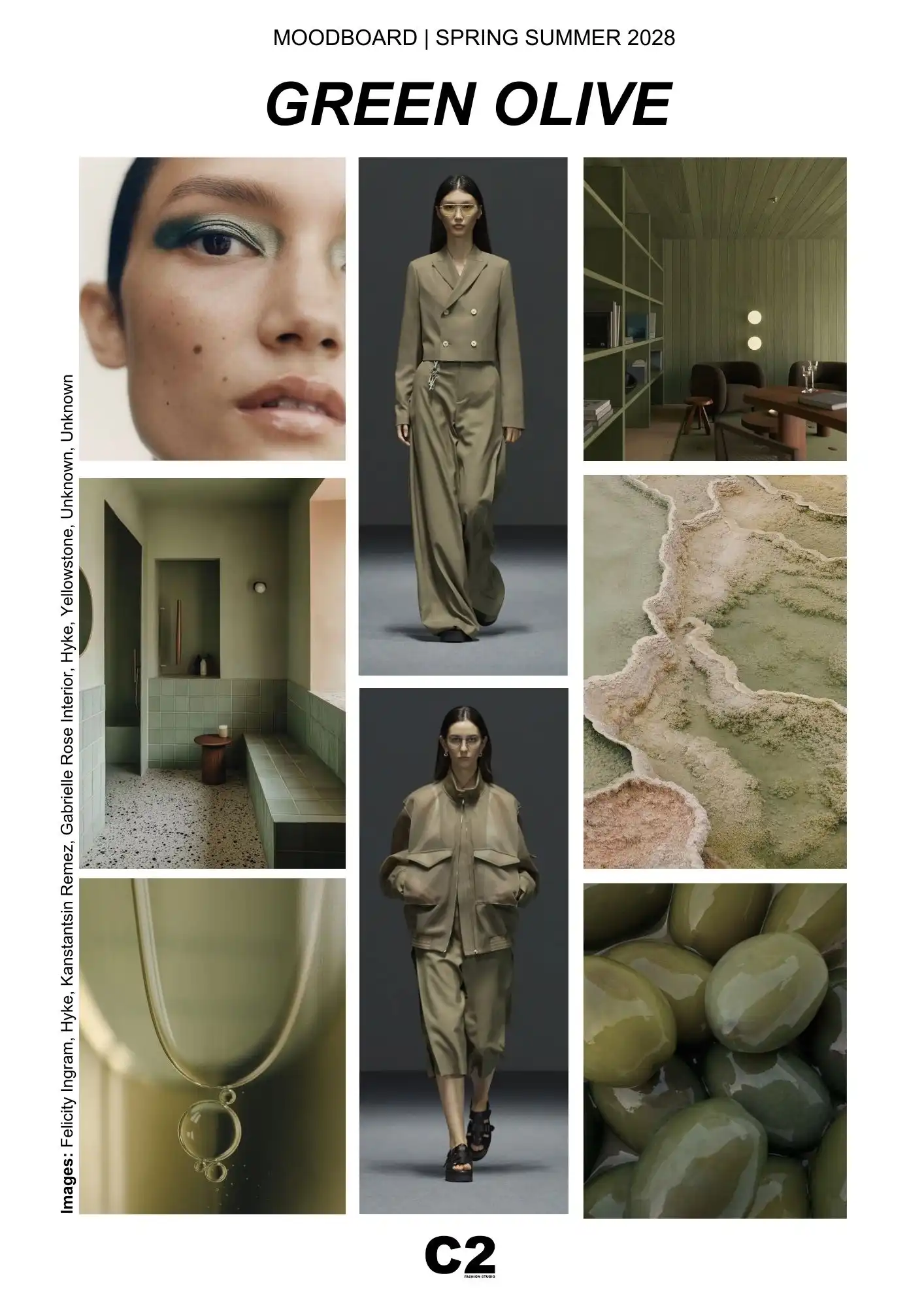
GREEN OLIVE – Pantone 17-0535 TCX | Spring Summer 2028 Color Trend Forecast
In the Spring Summer 2028 color trend forecasts, Green Olive (Pantone 17-0535 TCX) emerges as a foundational hue that reflects a shift toward grounded intelligence, material realism, and long-term stability. Interpreted through the lens of C2 Fashion Studio’s trend forecasting approach, this color embodies a new relationship between nature, function, and design—one that is deliberate, controlled, and deeply contemporary.
Green Olive is not a decorative green, nor a nostalgic reference to the natural world. It is a governed, mineral-inflected olive, softened by grey undertones that reduce saturation and visual noise. Within SS28 color trends, it operates as a stabilising force, offering reassurance and continuity in a landscape increasingly defined by uncertainty. Its muted depth communicates reliability, endurance, and composure rather than escapism.
Green Olive captures a new cultural relationship with nature—one shaped by pragmatism rather than idealism. In SS28, it reflects a world that no longer romanticises the natural environment, but seeks to coexist with it intelligently. This tone speaks to systems thinking, long-term responsibility, and adaptive lifestyles, where balance replaces excess. Green Olive resonates with communities prioritising durability, function, and material honesty over surface aesthetics. It embodies a grounded, responsible mindset, translating ecological awareness into calm, stabilising visual codes that support continuity rather than disruption.
From a systemic and material perspective, Green Olive aligns with the growing demand for colors that perform across multiple applications. It translates seamlessly into tailoring, outerwear, utility pieces, accessories, interiors, and product design. Its adaptability supports modular wardrobes, long-life collections, and cross-seasonal strategies—key considerations in contemporary Color Trend Forecasting.
Culturally, Green Olive resonates with a broader recalibration of values in Spring Summer 2028. It reflects a collective move away from idealised nature toward designed ecosystems, where balance, efficiency, and coexistence take precedence over raw expression. The color evokes landscapes shaped by time—stone, earth, vegetation filtered through climate and use—making it particularly relevant for brands engaging with sustainability, durability, and material honesty.
In visual terms, Green Olive absorbs light rather than reflecting it aggressively, contributing to luminous balance and perceptual calm. This quality reduces sensory fatigue and supports clarity, making it effective in environments and products intended to feel protective, functional, and emotionally steady.
According to insights developed by C2 Fashion Studio, and echoed across fashion, architecture, and industrial design, Green Olive represents a key anchor within the Color Trends for Spring Summer 2028. It expresses a form of renewed energy that is restrained and resilient—positioning color as an infrastructure for modern living, where stability, clarity, and thoughtful design guide every decision.
MOONLIT OCEAN – Pantone 19-4122 TCX | Spring Summer 2028 Color Trend Forecast
Within the Spring Summer 2028 color trend forecasts, Moonlit Ocean (Pantone 19-4122 TCX) emerges as the defining deep tone of the season, establishing a new visual language of authority, clarity, and composure. As identified through C2 Fashion Studio’s forecasting research, and reinforced by parallel industry signals, this near-black navy replaces traditional dark neutrals with a softer, more intelligent form of depth.
Moonlit Ocean is not a classic navy, nor a dramatic midnight blue. It is a dense, light-absorbing blue, enriched with subtle grey undertones that remove sharp contrast and visual aggression. In the context of SS28 color trends, it functions as a structural color—one that anchors collections, environments, and brand identities without overpowering surrounding tones. Its strength lies in restraint.
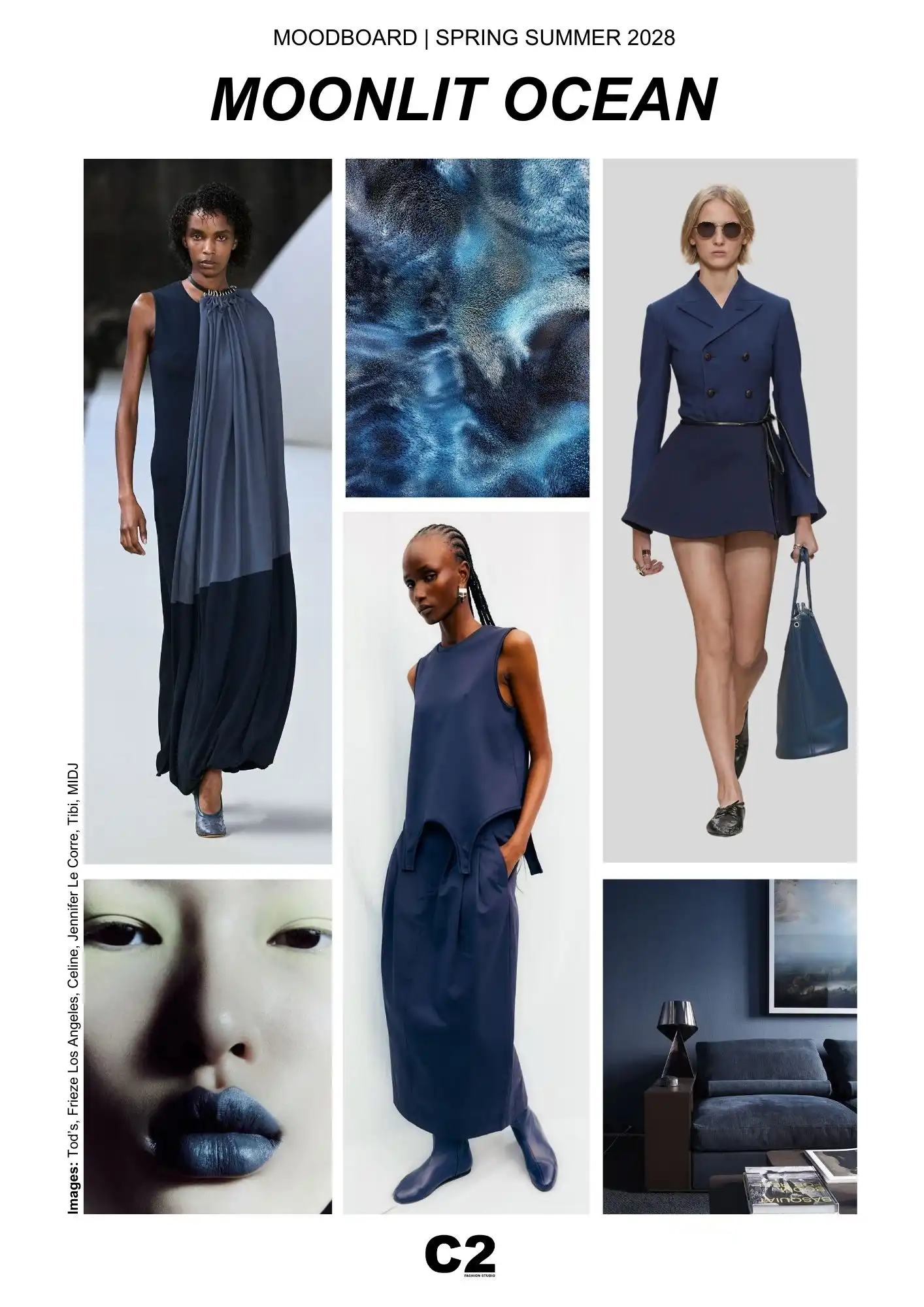
Moonlit Ocean reflects a sociocultural return to quiet authority and composure. In Spring Summer 2028, darker tones evolve beyond formality to become symbols of trust, reliability, and internal order. This color aligns with societies navigating complexity by valuing clarity over dominance and structure over noise. Moonlit Ocean expresses confidence without aggression, offering depth that feels protective and stable. It mirrors a collective desire for systems that hold rather than overwhelm, positioning restraint and precision as contemporary markers of leadership and credibility.
From a trend forecasting and product strategy perspective, Moonlit Ocean responds to a growing demand for reliability and control across fashion and lifestyle systems. It conveys trust, precision, and permanence—qualities increasingly valued in a market seeking stability and long-term relevance. This makes it particularly effective for tailoring, minimal silhouettes, outerwear, accessories, footwear, and interior design applications.
Visually, Moonlit Ocean supports luminous balance by absorbing light rather than reflecting it sharply. This creates depth without heaviness, allowing the color to feel appropriate for Spring Summer 2028 despite its darkness. When paired with softer neutrals or skin-adjacent tones, it enhances contrast gently, preserving clarity while avoiding visual fatigue.
Across cultural, technological, and commercial landscapes, darker colors are evolving from symbols of formality to markers of calm authority. Observed through C2 Fashion Studio’s analytical framework, Moonlit Ocean reflects this transition by offering a sense of order in a visually saturated world. It speaks to precision, intention, and thoughtful design decisions rather than dominance or severity.
As part of the Color Trends for Spring Summer 2028, Moonlit Ocean defines a season grounded in stability, luminous clarity, and renewed energy. It is a color designed not to attract attention, but to hold it—positioning depth as a strategic asset and reaffirming the role of color as an infrastructure for modern, intelligent design.
LINEN – Pantone 12-1008 TCX | Spring Summer 2028 Color Trend Forecast
In the Spring Summer 2028 color trend forecasts, Linen (Pantone 12-1008 TCX) emerges as a fundamental neutral that redefines lightness through softness, clarity, and stability. Interpreted through the analytical lens developed by C2 Fashion Studio, and echoed across multiple forecasting signals, Linen reflects a growing need for visual calm and perceptual balance in contemporary design.
Linen is not a traditional off-white nor a decorative beige. It is a warm, tactile neutral, infused with subtle undertones that recall natural fibres, skin, and mineral surfaces. Within SS28 color trends, Linen functions as a grounding base—one that reduces contrast fatigue and supports continuity across collections. Its role is not to disappear, but to create space: visual, emotional, and material.
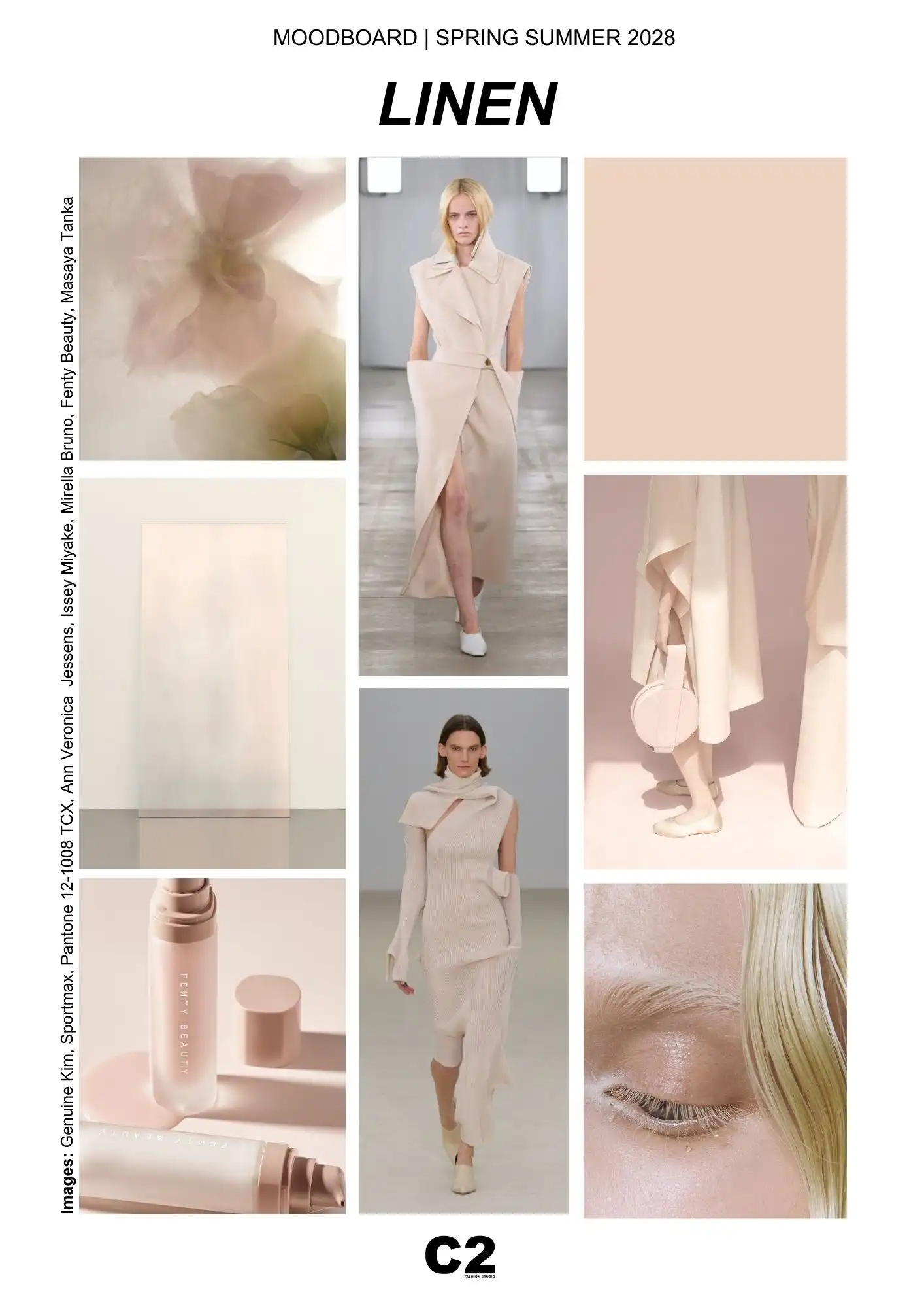
Linen embodies a cultural recalibration toward simplicity that feels intentional, not minimalistic. In SS28, this warm neutral reflects the growing importance of comfort, authenticity, and sensory calm across daily environments. Linen resonates with lifestyles seeking relief from visual overload, favouring softness, tactility, and continuity. It reflects a broader societal movement toward slower rhythms, reduced friction, and emotional clarity. As a color, Linen creates space—both visually and mentally—supporting a culture that values balance, trust, and sustainable forms of wellbeing over constant stimulation.
From a trend forecasting and product strategy perspective, Linen aligns with the shift toward modular systems and long-life design. It performs exceptionally across categories such as soft tailoring, knitwear, dresses, footwear, accessories, beauty packaging, interiors, and retail environments. Its adaptability allows it to connect disparate materials and silhouettes, reinforcing coherence without visual rigidity.
Linen also plays a crucial role in establishing luminous balance. Rather than reflecting light sharply, it diffuses luminosity gently, creating an atmosphere of calm clarity. This quality supports SS28’s emphasis on softness and restraint, enabling collections to feel light and breathable without becoming fragile or ephemeral. It is a color that stabilises perception while maintaining warmth and approachability.
Across cultural, commercial, and material contexts, Linen resonates with a broader recalibration of values. It reflects a desire for reliability, comfort, and authenticity—qualities increasingly associated with trust and quality rather than minimalism alone. Observed through C2 Fashion Studio’s forecasting framework, Linen represents a renewed understanding of neutrality as an active design choice rather than a default.
As part of the Color Trends for Spring Summer 2028, Linen anchors the season in soft light, tactile clarity, and enduring balance. It is a color designed to hold space, connect systems, and support thoughtful design decisions—positioning neutrality as one of the most powerful expressions of contemporary color intelligence.
AQUACADE – Pantone 14-5117 TCX | Spring Summer 2028 Color Trend Forecast
Within the Spring Summer 2028 color trend forecasts, Aquacade (Pantone 14-5117 TCX) emerges as the most expressive yet controlled hue of the season—introducing freshness, fluidity, and renewed energy without tipping into escapism or excess. Read through C2 Fashion Studio’s trend forecasting perspective, Aquacade represents a new generation of aquatic tones: intelligent, softened, and system-ready.
Aquacade is not a tropical turquoise nor a high-saturation aqua. It is a refined blue-green, cooled by grey undertones and calibrated to feel breathable rather than playful. In the context of SS28 color trends, this distinction is critical. Aquacade delivers a sense of movement and vitality while remaining grounded, aligning with a broader demand for colors that energise gently rather than stimulate aggressively.
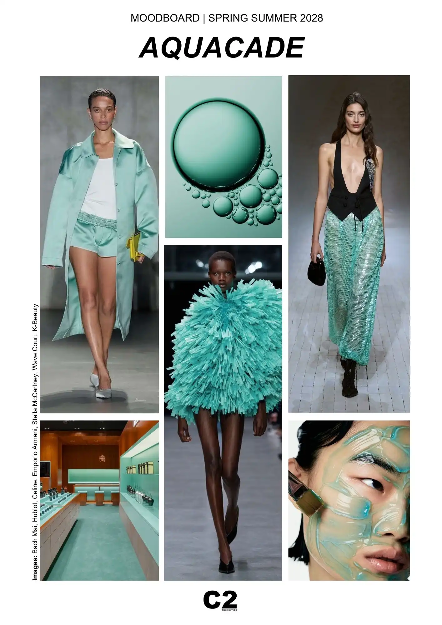
Aquacade expresses a renewed cultural desire for fluidity and adaptability without escapism. In Spring Summer 2028, it reflects societies navigating change by embracing flexibility, responsiveness, and emotional ease. This refined aqua tone connects to water as a symbol of renewal, movement, and balance, translating freshness into a controlled, intelligent expression. Aquacade aligns with wellness-oriented lifestyles and adaptive systems, where energy is measured and restorative. It represents optimism that is grounded rather than idealistic, offering clarity and lightness while remaining anchored in stability.
From a material and product standpoint, Aquacade performs exceptionally well across both soft and technical applications. It translates seamlessly onto fluid fabrics, coated surfaces, performance textiles, knitwear, accessories, beauty formulations, and interior finishes. Its water-inflected quality makes it particularly relevant for categories that intersect with wellness, care, and adaptive lifestyles—areas gaining strategic importance within Color Trend Forecasting for Spring Summer 2028.
Visually, Aquacade contributes to luminous balance by reflecting light in a diffused, translucent way. It introduces clarity and openness into seasonal palettes without creating sharp contrast. This makes it ideal as a counterpoint to deeper anchor tones, adding air and dimensionality while preserving visual calm. Used in tonal layering or paired with warm neutrals, Aquacade reinforces a sense of controlled renewal.
Beyond aesthetics, Aquacade reflects a broader systemic shift. It resonates with design approaches that prioritise flexibility, responsiveness, and emotional ease—qualities increasingly valued in fashion, interiors, and product ecosystems. As observed through C2 Fashion Studio’s analytical framework, Aquacade expresses a form of renewed energy that is measured and sustainable, favouring continuity over spectacle.
As part of the Color Trends for Spring Summer 2028, Aquacade defines a future-facing softness—one that refreshes the palette while maintaining stability, clarity, and long-term relevance.
Spring Summer 2028 colors reflect a shift in how design authority is expressed.
Rather than functioning as expressive gestures, color becomes a stabilising language—one that supports clarity, continuity, and long-term relevance across fashion and product systems.
5 Key Takeaways to Read Spring Summer 2028 Colors
1. Stability Becomes a Visual Value
SS28 palettes are built to hold rather than impress. Colors communicate reliability, composure, and permanence, responding to a wider cultural need for balance in a world shaped by constant acceleration.
2. Luminous Balance Defines the Season
Light is present, but controlled. Colors interact with luminosity softly, creating depth without glare. This measured brightness contributes to calm perception and refined visual rhythm.
3. Softness Signals Maturity
Powdered, skin-adjacent tones express emotional intelligence rather than fragility. Softness in SS28 is not decorative; it conveys confidence, restraint, and human presence.
4. Clarity Emerges Through Cohesion
Reduced contrast and tonal continuity shape collections that feel resolved and intentional. Visual clarity comes from coherence, not simplification.
5. Renewed Energy Is Quiet and Adaptive
Freshness appears through fluid, breathable hues that suggest movement and renewal without disruption. Energy is subtle, sustained, and system-driven.
Spring Summer 2028 Color Trend Forecasts
Decode the Season’s Key Colors — Join C2 Trend Platform
Understanding the Spring Summer 2028 color trends requires more than observing visual aesthetics. Each color direction is rooted in deeper socio-cultural signals, emotional shifts, and global behavioral patterns that are shaping the future of fashion and lifestyle. Through advanced trend forecasting, C2 Fashion Studio interprets these forces to transform color into a strategic design tool,
The SS28 Color Trend Forecasts are developed by mapping evolving consumer behavior, cultural dynamics, and market transitions. This approach allows brands, designers, creative directors, and product managers to anticipate not only what colors will emerge, but why they matter, and how they perform across fashion, accessories, interiors, and lifestyle categories. Color becomes a system of meaning—supporting stability, luminous balance, clarity, and renewed energy within contemporary collections.
The five key colors presented here represent only the entry point to the Spring Summer 2028 narrative. To access the complete seasonal palette and gain in-depth insights into each hue’s cultural relevance, material application, and commercial potential, professionals are invited to join the C2 Trend Platform.
Subscribers receive exclusive access to early Color Trend Forecasts, long-range seasonal analysis, and curated creative intelligence designed to inform strategic decisions and accelerate innovation. By leveraging C2’s proprietary forecasting methodology, fashion professionals gain a competitive advantage—building collections that align with the Key Color Directions for Spring Summer 2028 and resonate with the emotional and cultural expectations of future consumers.
Join C2 Trend Platform to unlock the full Spring Summer 2028 Color Forecasts from 20th February and stay ahead of the next shift in color intelligence.
Views


Trend Forecasting Intelligence
C2 Trend Platform.
Structured trend forecasting for clarity, product direction, and collections aligned with future demand.
Trend Forecasting Intelligence