Spring Summer 2028 Color Trend Forecast: The Evolving Power of Luminous Balance
Color Trend Forecast Spring Summer 2028: A New Era of Visual Equilibrium
According to C2 Fashion Studio Trend Forecasting, Spring Summer 2028 introduces a new color direction defined by stability, luminous balance, clarity, and renewed energy. As brands navigate an increasingly complex marketplace, color is evolving beyond aesthetics to become a strategic tool for communication, product development, and emotional connection.
Luminous Balance emerges as a Color Trend Forecast that reflects broader cultural shifts identified through Trend Intelligence, Consumer Behavior analysis, and Material Intelligence research.
Rather than relying on extremes, the palette proposes a sophisticated balance between calming neutrals, optimistic brights, mineral tones, and nature-inspired shades.
Trend Intelligence Spring Summer 2028: Why Color Matters More Than Ever
Color has become one of the most powerful tools available to brands seeking to communicate relevance and emotional value. Through Trend Intelligence, it is increasingly clear that consumers are responding positively to color systems that offer reassurance, optimism, and clarity.
The Spring Summer 2028 season sees color functioning as a visual language capable of translating complex cultural signals into accessible product experiences.
According to C2 Fashion Studio Trend Forecasting, the growing importance of emotional wellbeing, conscious consumption, and intentional living is directly influencing color development across fashion, beauty, interiors, and lifestyle categories.
Consumer Behavior and the Demand for Emotional Clarity
Consumer Behavior research reveals a growing preference for products that support feelings of calmness, stability, and confidence. While Luminous Balance is not a consumer trend itself, it responds to emerging consumer expectations for products that feel emotionally supportive and visually harmonious.
This creates opportunities for brands to develop color stories that align with evolving market needs while maintaining strong commercial appeal.
Fashion Trend Forecasting and the Evolution of Color Systems
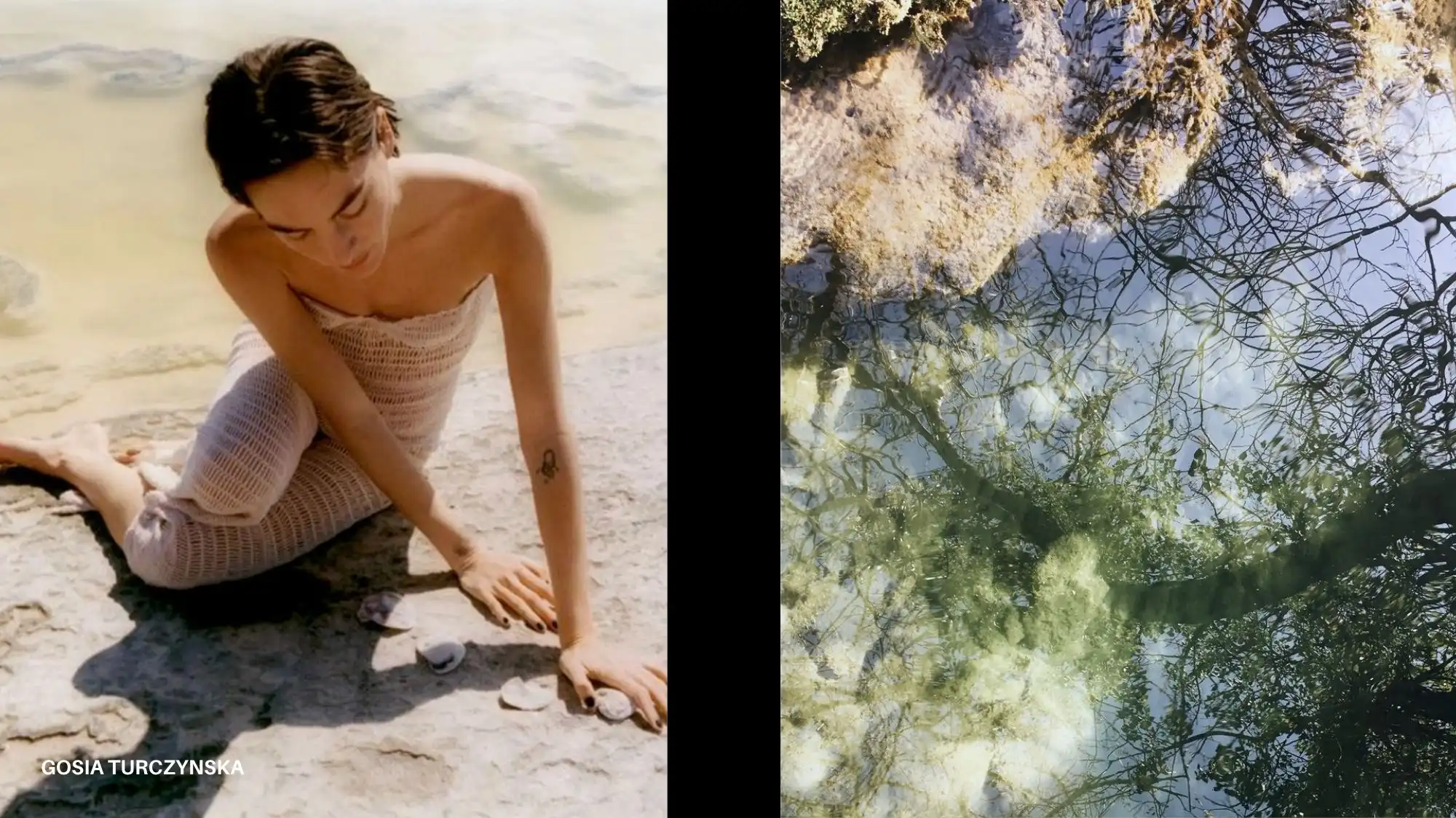
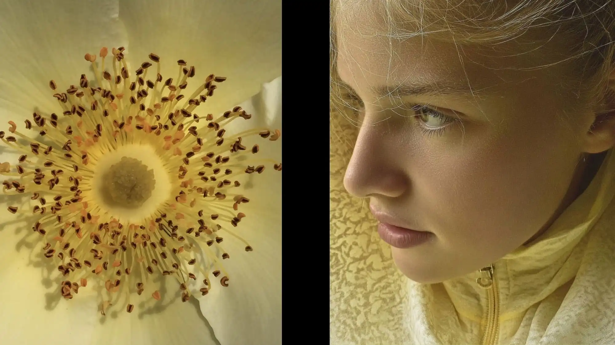
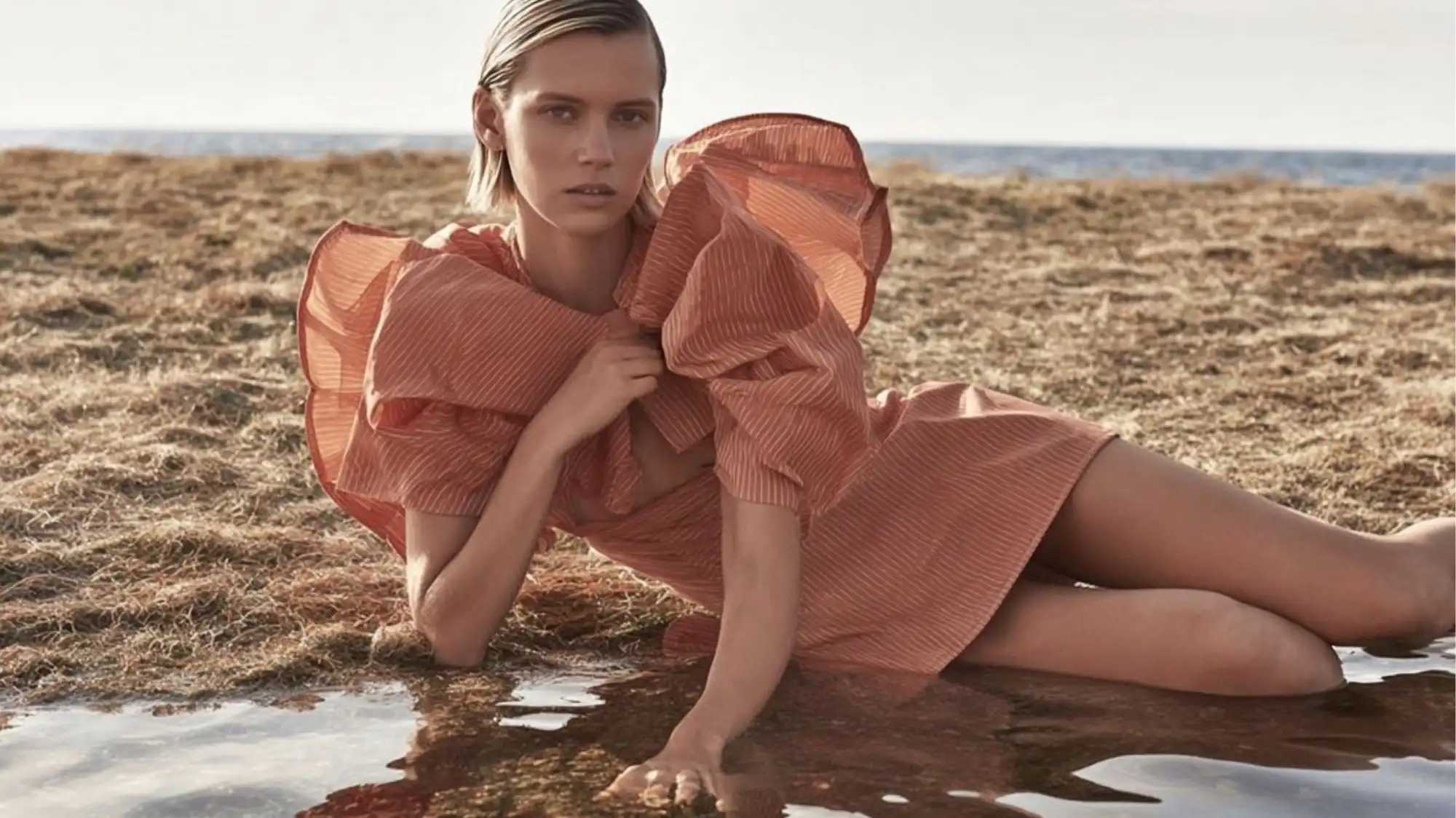
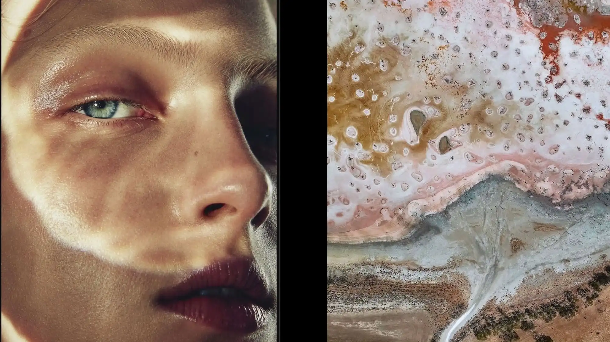
The Luminous Balance palette is built around carefully calibrated contrasts. Soft neutrals interact with luminous blues, botanical yellows, muted pinks, and grounded greens to create palettes that feel both contemporary and timeless.
Key colors include:
- Moonlit Ocean
- Linen
- Aquacade
- Green Olive
- Ash Rose
- Iris Yellow
Together these shades create a sophisticated visual framework capable of supporting multiple product categories and market segments.
Material Intelligence and Color Development
Material Intelligence plays a critical role in the success of Luminous Balance. The direction is particularly effective when applied to natural fibers, regenerative textiles, linen blends, lightweight cottons, bio-based materials, technical surfaces, and next-generation sustainable fabrics.
As materials evolve, color application becomes increasingly important in communicating quality, innovation, and emotional value.
The interaction between texture, finish, and color creates new opportunities for product differentiation while reinforcing the broader themes of stability and clarity that define Spring Summer 2028.
Trend Forecasting Spring Summer 2028: From Fashion to Lifestyle
Luminous Balance extends beyond fashion apparel into beauty, accessories, interiors, packaging, and wellness products.
Its versatility allows brands to create cohesive cross-category narratives while maintaining a strong emotional connection with consumers. The palette supports both premium and mass-market applications, making it one of the most commercially relevant Color Trend Forecast directions for the season.
According to C2 Fashion Studio Trend Forecasting
According to C2 Fashion Studio Trend Forecasting, Luminous Balance represents one of the defining Color Trend Forecast directions for Spring Summer 2028. Supported by Trend Intelligence, Consumer Behavior insights, and Material Intelligence research, the direction reflects a growing demand for color systems that balance sophistication, optimism, clarity, and emotional resonance.
As brands prepare future collections, Luminous Balance offers a strategic framework for creating products that feel contemporary, desirable, and aligned with the evolving cultural landscape of Spring Summer 2028.
Join C2 Trend Platform and Explore the Future of Spring Summer 2028
Luminous Balance is a Color Future Direction for Spring Summer 2028, identified through the ongoing Trend Forecasting, Trend Intelligence, Consumer Behavior, and Material Intelligence research conducted by C2 Fashion Studio. It reflects the growing importance of color as a strategic tool for creating emotional connection, visual clarity, and product relevance across multiple industries.
On the C2 Trend Platform, subscribers gain access to exclusive Spring Summer 2028 Color Trend Forecasts, emerging color directions, material innovations, consumer insights, print and pattern forecasts, and future-focused trend analysis designed to support product development and strategic decision-making.
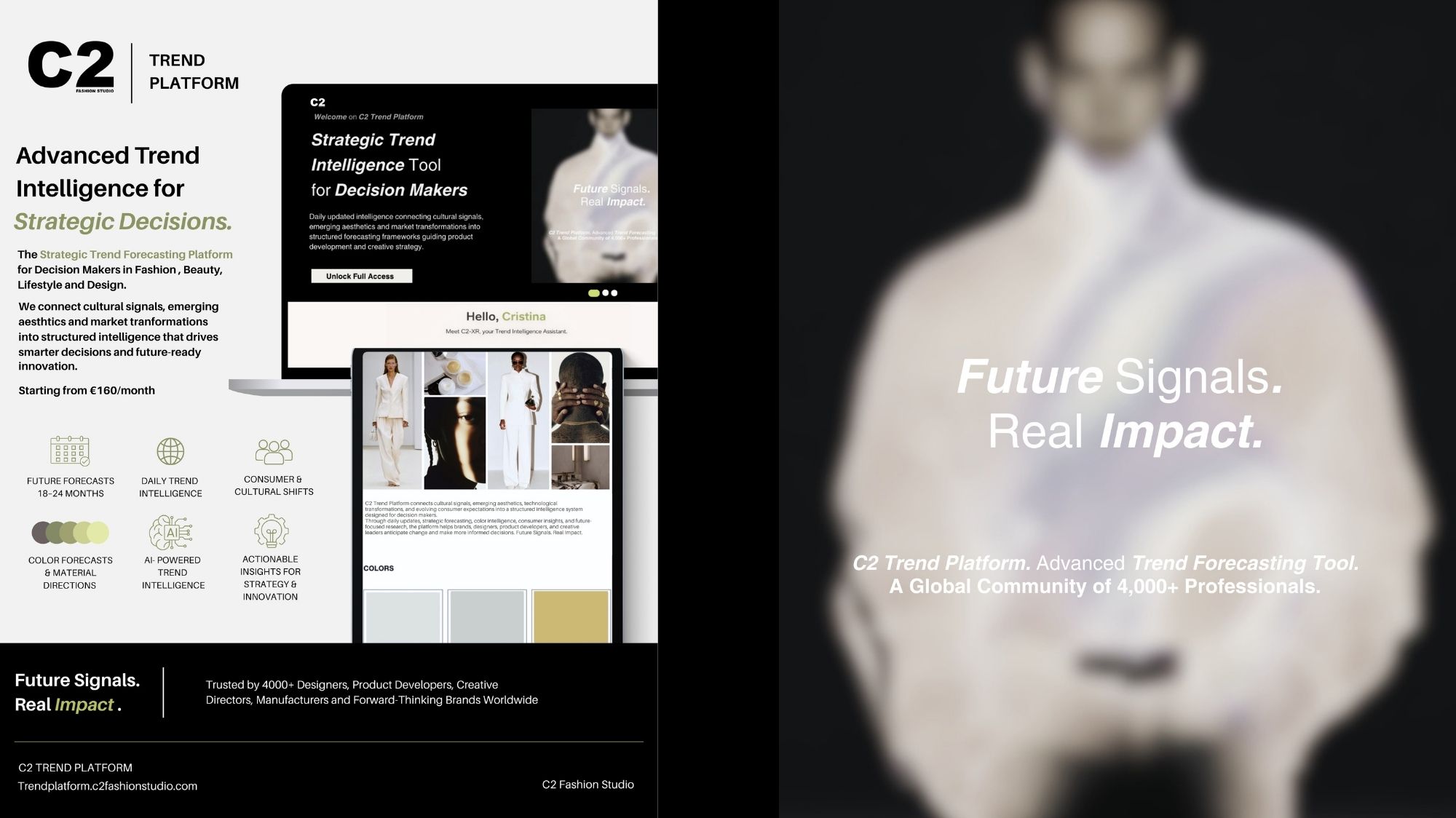
The platform is created for designers, brands, retailers, manufacturers, consultants, and creative professionals seeking actionable Trend Intelligence and long-term market visibility.
Join the C2 Trend Platform today to explore the complete Spring Summer 2028 forecasts and discover how Color Trend Forecasting, Consumer Behavior insights, and Material Intelligence can help shape the next generation of products, collections, and creative strategies.
Frequently Asked Questions
What is Luminous Balance in the Spring Summer 2028 Color Trend Forecast?
Luminous Balance is a Color Future Direction for Spring Summer 2028 identified by C2 Fashion Studio. The direction explores the relationship between stability, clarity, renewed energy, and emotional resonance through carefully balanced color palettes that combine luminous tones with grounded neutrals.
Why is Luminous Balance relevant for Spring Summer 2028?
According to C2 Fashion Studio Trend Forecasting, consumers and brands are increasingly seeking products that communicate reassurance, optimism, and sophistication. Luminous Balance responds to these cultural and market shifts through color systems that support visual harmony and contemporary relevance.
Which colors define the Luminous Balance palette?
The direction includes key shades such as Moonlit Ocean, Linen, Aquacade, Green Olive, Ash Rose, and Iris Yellow. Together, these colors create a versatile palette that balances freshness, warmth, clarity, and emotional depth across multiple product categories.
How does Consumer Behavior influence Color Trend Forecasting?
Consumer Behavior provides valuable insight into how people respond emotionally to products, environments, and visual experiences. While Luminous Balance is a Color Trend Forecast rather than a consumer trend, it is informed by broader shifts in lifestyle expectations, wellbeing priorities, and purchasing preferences.
How can brands apply Luminous Balance to product development?
Brands can use Luminous Balance across fashion, accessories, beauty, interiors, packaging, and lifestyle products. Combined with Trend Intelligence and Material Intelligence, the direction offers a strategic framework for developing products that feel contemporary, commercially relevant, and aligned with the evolving Spring Summer 2028 market.
Views


Trend Forecasting Intelligence
C2 Trend Platform.
Structured trend forecasting for clarity, product direction, and collections aligned with future demand.
Trend Forecasting Intelligence